mirror of
https://github.com/jkriege2/JKQtPlotter.git
synced 2024-11-16 02:25:50 +08:00
137 lines
4.5 KiB
Markdown
137 lines
4.5 KiB
Markdown
# Example (JKQTPlotter): Barchart With Two-Color Fill-Mode {#JKQTPlotterBarchartsTwoColorFilling}
|
|
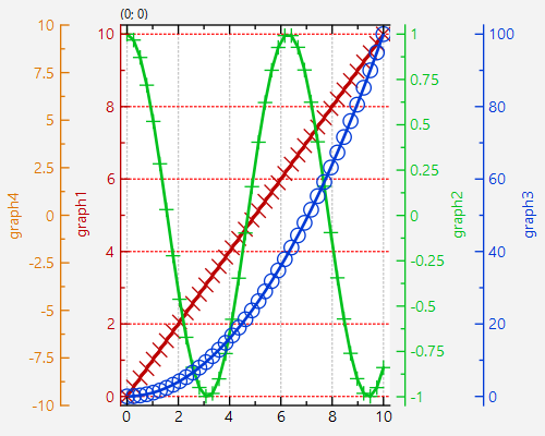
This project (see [`second_axis`](https://github.com/jkriege2/JKQtPlotter/tree/master/examples/second_axis) shows how to plot with multiple axes.
|
|
|
|
The source code of the main application is (see [`second_axis.cpp`](https://github.com/jkriege2/JKQtPlotter/tree/master/examples/second_axis/second_axis.cpp).
|
|
|
|
In the code we take these step to set up a plot with two secondary axes and three graphs:
|
|
|
|
|
|
1./2. create a plotter and create columns with different dataset:
|
|
|
|
```.cpp
|
|
// 1. create a plotter window and get a pointer to the internal datastore (for convenience)
|
|
JKQTPDatastore* ds=plot.getDatastore();
|
|
|
|
// 2. now we create two columns for key and value
|
|
size_t columnX=ds->addLinearColumn(40, 0,10,"x");
|
|
size_t columnY1=ds->addColumnCalculatedFromColumn(columnX, [](double x) { return x; }, "y1");
|
|
size_t columnY2=ds->addColumnCalculatedFromColumn(columnX, [](double x) { return cos(x); }, "y2");
|
|
size_t columnY3=ds->addColumnCalculatedFromColumn(columnX, [](double x) { return x*x; }, "y3");
|
|
```
|
|
|
|
3. create a second y-axis and set its formating options, so it only draws an axis on the right
|
|
|
|
```.cpp
|
|
auto yAxisRef2=plot.getPlotter()->addSecondaryYAxis(new JKQTPVerticalAxis(plot.getPlotter(), JKQTPPrimaryAxis));
|
|
plot.getYAxis(yAxisRef2)->setDrawGrid(false);
|
|
plot.getYAxis(yAxisRef2)->setDrawMode1(JKQTPCADMnone);
|
|
plot.getYAxis(yAxisRef2)->setDrawMode2(JKQTPCADMcomplete);
|
|
plot.getYAxis(yAxisRef2)->setDrawMode0(JKQTPCADMnone);
|
|
plot.getYAxis(yAxisRef2)->setShowZeroAxis(false);
|
|
```
|
|
|
|
... and ctreate third y-axis
|
|
|
|
```.cpp
|
|
auto yAxisRef3=plot.getPlotter()->addSecondaryYAxis(new JKQTPVerticalAxis(plot.getPlotter(), JKQTPPrimaryAxis));
|
|
plot.getYAxis(yAxisRef3)->setDrawGrid(false);
|
|
plot.getYAxis(yAxisRef3)->setDrawMode1(JKQTPCADMnone);
|
|
plot.getYAxis(yAxisRef3)->setDrawMode2(JKQTPCADMcomplete);
|
|
plot.getYAxis(yAxisRef3)->setDrawMode0(JKQTPCADMnone);
|
|
plot.getYAxis(yAxisRef3)->setShowZeroAxis(false);
|
|
```
|
|
|
|
... reformat the major y-axis, so it does not draw on the right and thus the secondary axis yAxisRef2 replaces it there. If this step is omitted, the secondary axes stack on the right of the primary.
|
|
|
|
```.cpp
|
|
plot.getYAxis()->setDrawMode2(JKQTPCADMnone);
|
|
plot.getYAxis()->setColor(graph1->getLineColor());
|
|
```
|
|
|
|
3. create graph in the plot, which plots the dataset:
|
|
|
|
3.1 the first graph uses the default (primary) x/y-axes
|
|
|
|
```.cpp
|
|
JKQTPXYLineGraph* graph1=new JKQTPXYLineGraph(&plot);
|
|
graph1->setKeyColumn(columnX);
|
|
graph1->setValueColumn(columnY1);
|
|
plot.addGraph(graph1);
|
|
plot.getYAxis()->setAxisLabel("graph1");
|
|
```
|
|
|
|
3.2 the second graph uses the default (primary) x-axis, but the secondary axis yAxisRef2 as y-axis
|
|
|
|
```.cpp
|
|
JKQTPXYLineGraph* graph2=new JKQTPXYLineGraph(&plot);
|
|
graph2->setKeyColumn(columnX);
|
|
graph2->setValueColumn(columnY2);
|
|
plot.addGraph(graph2);
|
|
```
|
|
|
|
tell graph2 to use this axis
|
|
|
|
```.cpp
|
|
graph2->setYAxis(yAxisRef2);
|
|
```
|
|
|
|
set axis color to match graph2's color
|
|
|
|
```.cpp
|
|
plot.getYAxis(yAxisRef2)->setColor(graph2->getLineColor());
|
|
```
|
|
|
|
set axis label
|
|
|
|
```.cpp
|
|
plot.getYAxis(yAxisRef2)->setAxisLabel("graph2");
|
|
```
|
|
|
|
3.3 the third graph uses the default (primary) x-axis, but the secondary axis yAxisRef3 as y-axis
|
|
|
|
```.cpp
|
|
JKQTPXYLineGraph* graph3=new JKQTPXYLineGraph(&plot);
|
|
graph3->setKeyColumn(columnX);
|
|
graph3->setValueColumn(columnY3);
|
|
plot.addGraph(graph3);
|
|
plot.getYAxis(yAxisRef3)->setColor(graph3->getLineColor());
|
|
plot.getYAxis(yAxisRef3)->setAxisLabel("graph3");
|
|
graph3->setYAxis(yAxisRef3);
|
|
|
|
|
|
```
|
|
|
|
4. autoscale the plot so the graph is contained. This auto-scales all axes using the graphs (and their data) as assigned to the axes, i.e.:
|
|
- all 3 graphs for x-axis,
|
|
- graph1 for primary y-axis,
|
|
- graph2 for secondary axis yAxisRef2
|
|
- graph3 for secondary axis yAxisRef3
|
|
|
|
```.cpp
|
|
plot.zoomToFit();
|
|
```
|
|
|
|
5. show plotter and make it a decent size
|
|
|
|
```.cpp
|
|
plot.setWindowTitle(title);
|
|
plot.show();
|
|
plot.resize(500,400);
|
|
```
|
|
|
|
|
|
The result looks like this:
|
|
|
|

|
|
|
|
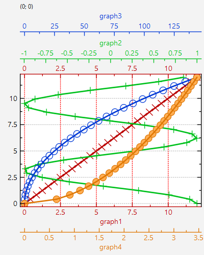
If we set seondary axes for the x-axis instead of the y-axis, i.e. use
|
|
```.cpp
|
|
// ...
|
|
auto xAxisRef2=plot.getPlotter()->addSecondaryXAxis(new JKQTPHorizontalAxis(plot.getPlotter(), JKQTPPrimaryAxis));
|
|
// ...
|
|
```
|
|
we get a plot like this:
|
|
|
|

|
|
|