- fixed additional renames JKQTPLotter->JKQTPlotter - improved documentation (boxplots, JKQTMathText) - added several examples |
||
|---|---|---|
| .. | ||
| example.bmp | ||
| jkqtplotter_simpletest_filledgraphs_and_lib.pro | ||
| jkqtplotter_simpletest_filledgraphs.cpp | ||
| jkqtplotter_simpletest_filledgraphs.pro | ||
| jkqtplotter_simpletest_filledgraphs.qrc | ||
| README.md | ||
Example (JKQTPlotter): Filled Curve Plots
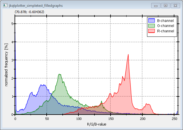
This project (see ./examples/simpletest_filledgraphs/) simply creates a JKQTPlotter widget (as a new window) and adds several filled curve graphs (Histograms). Data is initialized from QVector objects.
The source code of the main application can be found in jkqtplotter_simpletest_filledgraphs.cpp.
First the data columns for three x-y-curves are generated. One column of x-values with entries 0,1,2,...,254,255 (256 entries).
size_t columnX=ds->addLinearColumn(256, 0, 255, "x");
And three columns with 256 entries each, which will be filled with the R-, G- and B-histograms of an image example.bmp:
    size_t columnR=ds->addColumn(256, "historam_R");
    size_t columnG=ds->addColumn(256, "historam_G");
    size_t columnB=ds->addColumn(256, "historam_B");
In this example we will access the data in the internal datastore directly. This access is possible through objects of type JKQTPColumn, which is a proxy to the data in one of the columns in a JKQTdatastore:
    JKQTPColumn cG=ds->getColumn(columnG);
    JKQTPColumn cR=ds->getColumn(columnR);
    JKQTPColumn cB=ds->getColumn(columnB);
In order to calculate the histograms, first all enries in the columns are set to 0:
    cR.setAll(0);
    cG.setAll(0);
    cB.setAll(0);
Finally the histogram is calculated:
    QImage image(":/example.bmp");
    for (int y=0; y<image.height(); y++) {
        for (int x=0; x<image.width(); x++) {
            QRgb pix=image.pixel(x,y);
            cR.incValue(qRed(pix), 1);
            cG.incValue(qGreen(pix), 1);
            cB.incValue(qBlue(pix), 1);
        }
    }
    cR.scale(100.0/static_cast<double>(image.width()*image.height()));
    cG.scale(100.0/static_cast<double>(image.width()*image.height()));
    cB.scale(100.0/static_cast<double>(image.width()*image.height()));
Finally three JKQTPFilledCurveXGraph objects are generated and added to the plot (here we show the code for the R-channel only):
    JKQTPFilledCurveXGraph* graphR=new JKQTPFilledCurveXGraph(&plot);

    // set graph titles
    graphR->set_title("R-channel");

    // set graph colors (lines: non-transparent, fill: semi-transparent
    QColor col;
    col=QColor("red"); graphR->set_color(col);
    col.setAlphaF(0.25); graphR->set_fillColor(col);

    // set data
    graphR->set_xColumn(columnX); graphR->set_yColumn(columnR);


    // add the graphs to the plot, so they are actually displayed
    plot.addGraph(graphR);
The curves are fille with a semi-transparent color, which is achieved by setting col.setAlphaF(0.25) on the graph color col.
The result looks like this:
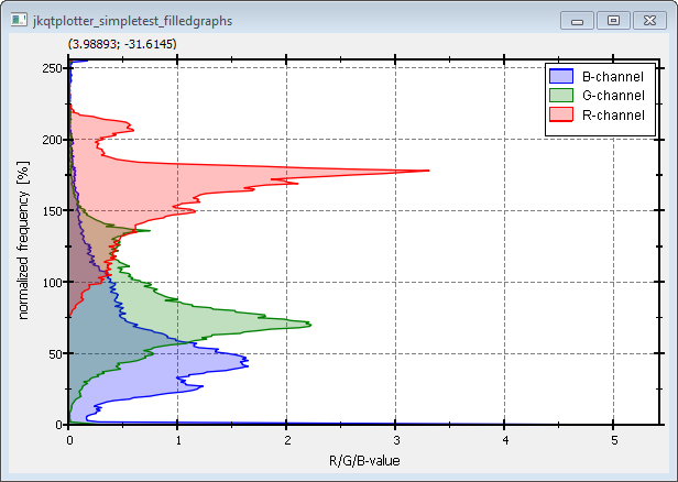
If you use JKQTPFilledCurveYGraph instead of JKQTPFilledCurveXGraph, the curve will not be filled until the y=0-axis, but until the x=0-axis. Of course you will also have to swap the x- and y-data columns. The result will look like this:

